(This is the 9th post in a series that started here)
In this series of posts, I’m trying out different things to see what they reveal. I didn’t expect that I’d do everything the best way the first time. Besides, viewing the same data sets in multiple ways can help create new insights and verify (or correct) old ones. I expect to learn things as I go along.
A wiser person might do their research behind closed doors, only revealing their conclusions once they’ve thought everything through. I’m exposing the process (and my lack of advanced statistical skilz) in the hope that I might improve my results because of helpful and interesting comments from y’all, and on the odd chance that other people find might find my learning process somewhat entertaining or enlightening.
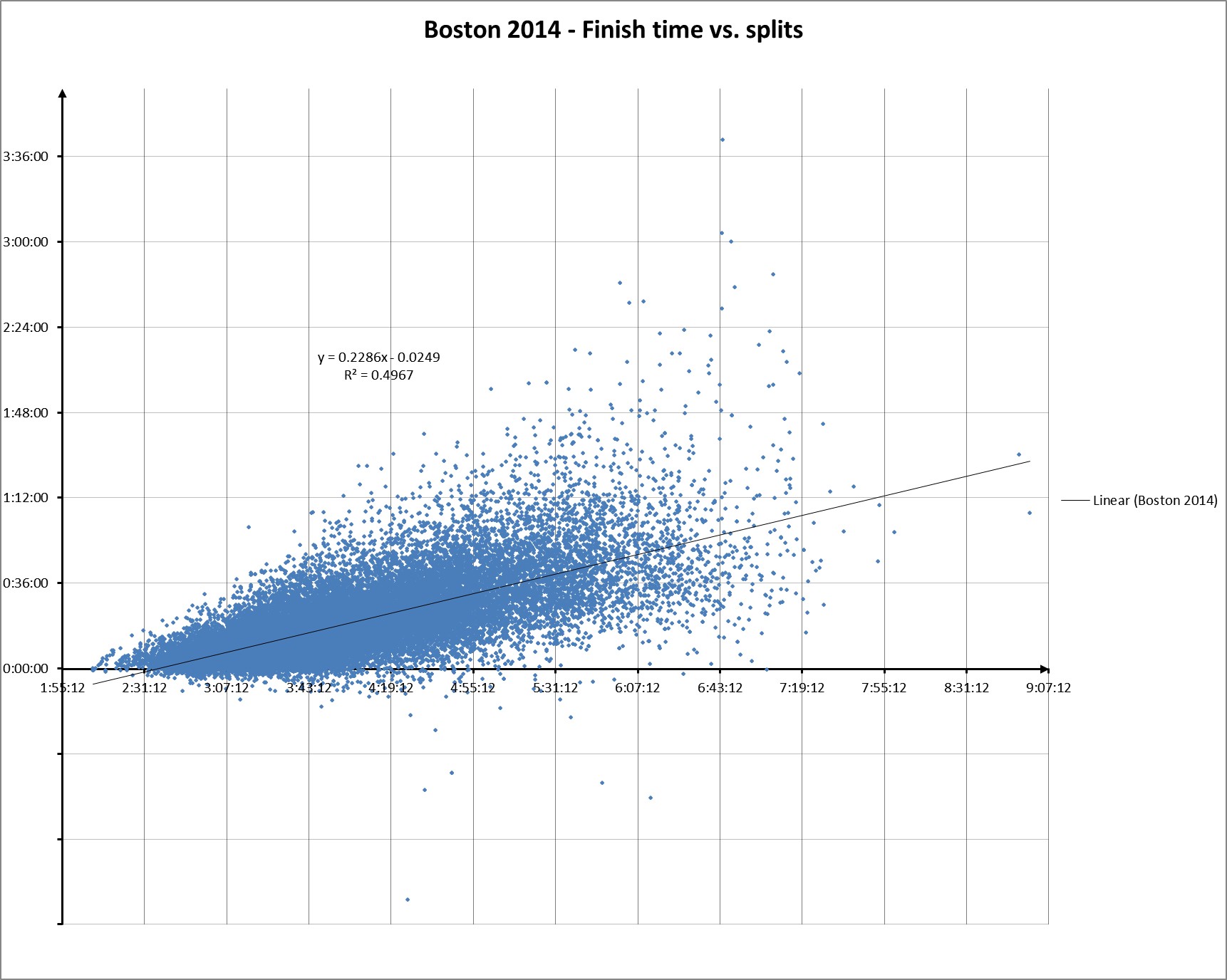
Today, I’m presenting another view of the Boston 2014 data, inspired in part by one of your comments. The chart below plots splits vs. finish time:
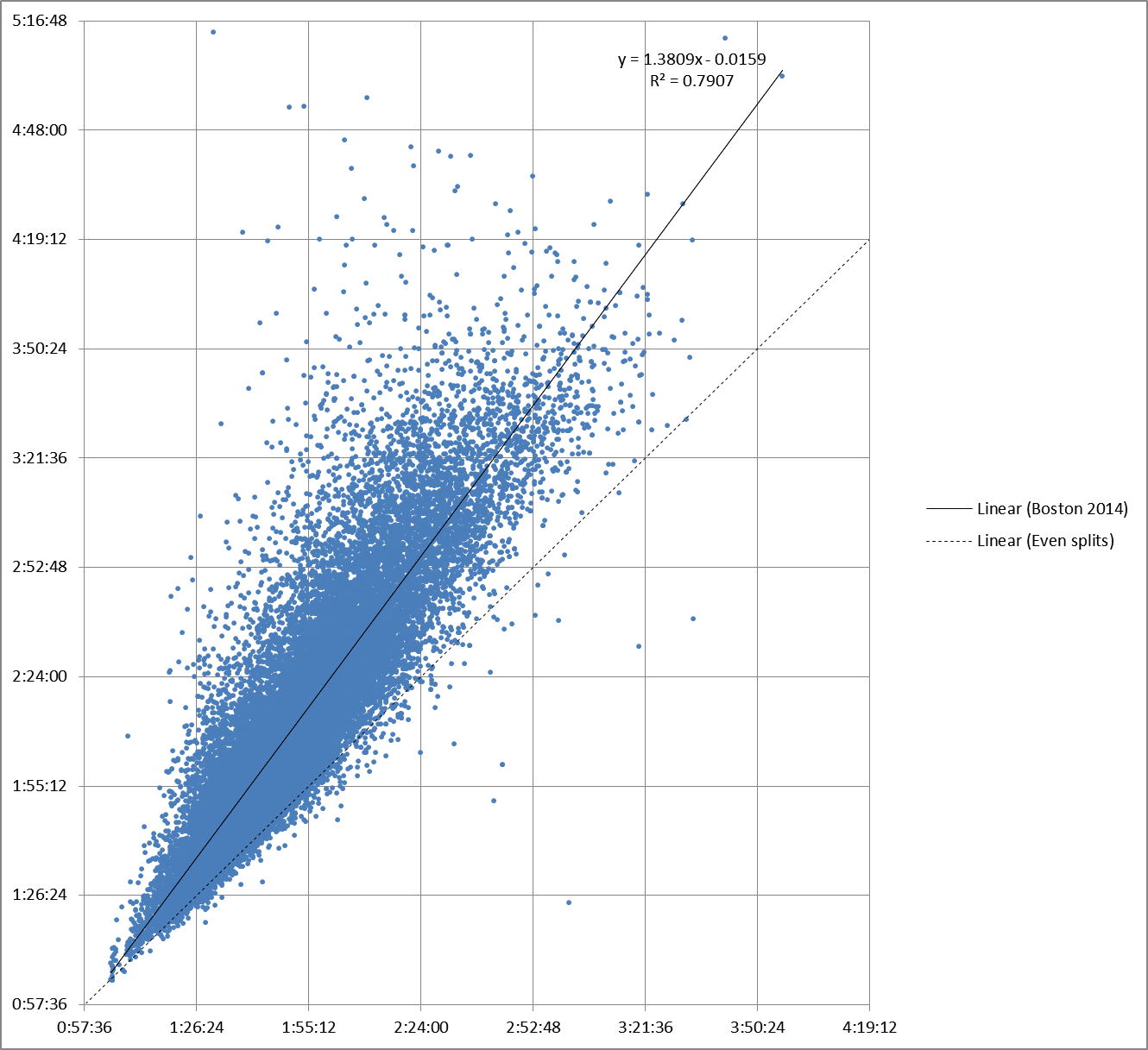
It’s essentially the same as my original chart of first half vs. second half splits:
…if you grab the latter chart by the even split line and rotate it 45° clockwise around the (0,0) axis so the even split line ends up on the X (horizontal) axis.
The new chart is better for many, perhaps most, uses.
You can see that Excel says R2 for the linear regression is lower, even though the scattergram is essentially the same. That’s because even though we’re looking at the same thing, by plotting finish time against splits we eliminate (I think) a source of autocorrelation error that was making R2 artificially high (something the reader “Stats” called out in a comment).
Polynomial regressions now reveal more about the actual distribution of the data. The 4th order poly on the chart below does a good job of confirming trends within the data set that we discovered earlier. And you can now use Excel to automatically generate moving averages, which makes life much easier.
You could also say this: Racing is about getting to the finish as fast as possible, so we’re usually interested in how things relate to finish time. Nevertheless, focusing the relationship between the first and second half splits can sometimes leads to fresh enlightenment.
An aside for the few who might care: Excel was originally designed to be compatible with Lotus 1-2-3, bugs and all, so the default time system used for calculations does not understand negative times. So to calculate splits with Excel for Windows, you have to go into the options and tell Excel to “Use 1904 Date System”. Excel for the Mac uses the 1904 system by default.
Anyhow, we’ll see more charts like these as we address new questions (and perhaps revisit a few old ones) in my next few posts.


